


Creative contrasts with black and white
31.03.2020
The love of black is universal. It is the difference between day and night, between being awake and being asleep. Black/white patterns and contrasts continue to play to the imagination and form the calm basis on which other colours come into their own.
Main image: The panelarium, Himeji (Japan). Source: www.frameawards.com
These days, no one really thinks twice about dressing completely in black and in interior design, black/white patterns endure. Nevertheless, we are seeing colour recover more and more ground from the sleek, white living rooms as inspired by Scandinavian design. Trend and colour watcher Hilde Francq answers some of our questions.
White is the sum of all colours of the light. White represents perfection and is the colour that is associated almost entirely with positives. It is the colour of a fresh start, innocence and youth. It has become a popular choice for interiors, especially since the 1990s and the emergence of minimalist styles. “Off white”, less harsh than pure white, harmonises better in an interior, such as white mixed with a hint of yellow, which adds a touch of warmth to the white.
By contrast, black is the absence of colour. It absorbs the light. In interiors, black represents style, elegance and a sense of chic. In practice “off black”, or black mixed with a little brown, green or blue, is a more pleasant and more subtle black.
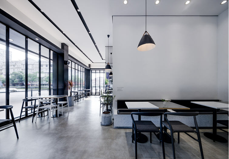
ITAFE café in Zhejiang (China). Source : www.archdaily.com
The power of attraction
We often find ourselves drawn to black/white contrasts in interiors as, much like the edges of a frame, they enhance the architecture in a room. The lines of a building are given additional visibility. The contrast between black and white is the greatest contrast there is,and black and white are truly timeless colours. Black/white interiors crop up throughout history, repeatedly. “The aspect of timelessness certainly plays a role. People feel that they can transcend new trends or that their interior will last longer.”
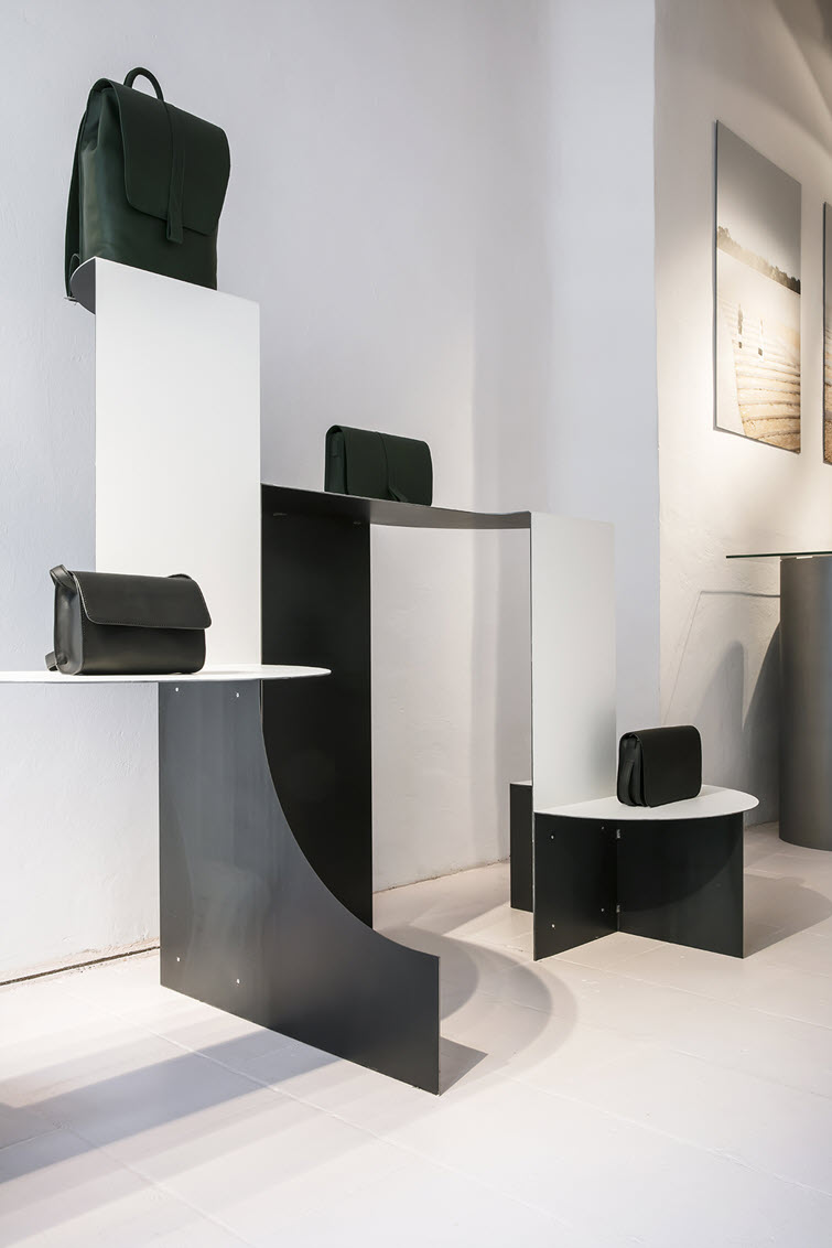
Atelier Bontekoe in Antwerp (Belgium). Source: www.frameweb.com
The greatest advantage of a black/white interior or of a monochrome interior is the stand-out, contrasting effect on other colours in the room. A black/white interior instantaneously improves the appearance of other colours in the room, making them more noticeable and bringing them to life. Black to white is a hard contrast and really emphasises the lineation. It shifts the attention from colour to other elements such as volume or texture. If you use different materials in an interior, the differences will be given additional emphasis — a matte black linoleum combined with a glossy, black tile for example.
It’s mostly artistic types who are attracted to black and white, often the same people who dress in black and white, like architects and artists. For them, black/white is a statement. They feel that colour is not something they need to reflect their personality.
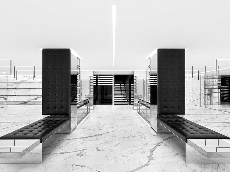
Saint Laurent store in Tokyo (Japan). Source : www.luxurylaunches.com
Timeless
Why is black/white timeless? And what does that mean? In ancient houses and churches, you often come across black/white chequerboard patterns on the floor. In the baroque, classical and interwar periods too, black/white patterns were common. It’s a combination that has taken on a timeless status. When it comes to truly timeless colours though, it’s hard to argue that there are any. In the 1970s, the back/white combination was firmly out and brown and beige interior shades were in. As the 1980s and 1990s progressed, black/white began to filter back through.
It’s a trend that constantly resurfaces. Black/white often looks dramatic and adds theatrical tension to an interior — that may be a reason. Plus, it’s timeless character also plays an important role. “Black/white contrasts have become iconic, a bit like the white shirt that we keep on going back to.”
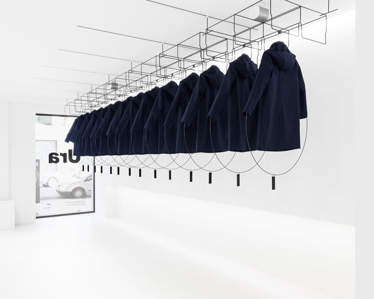
Ura clothing store in Gipuzkoa (Spain). Source: www.frameawards.com